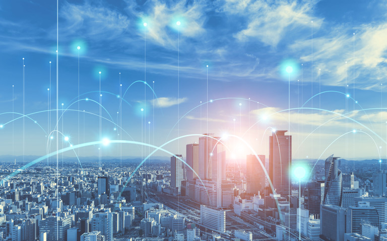
میں حال ہی میں اپنی ویب سائٹ اور ویب سرور کو اپ ڈیٹ کر رہا ہوں اور ایک نئی سائٹ شامل کر رہا ہوں (LoveCrete.org). میں چاہتا تھا کہ لیوکریٹ پر ایک بیک گراونڈ امیج ہو اور اس کو یقینا realized احساس ہوا 1 سائز ہر اسکرین پر فٹ نہیں ہوتا ہے. یہاں میری سوچ کیا تھی کا ایک خلاصہ ہے اور اسکرین کے متعدد سائز اور واقفیت کو پورا کرنے کے لئے میں نے کیا کیا.
کون سی سمت بندی
I started by making myself a little table of all the common resolutions used on پی سی and tablets (in horizontal orientation). I decided to focus on this because most images are available in landscape so this is a sensible place to start.
I decided that I would place images centrally on the page and let the edges be lost off the edge of the screen in some instances. When a phone is used in portrait orientation it will load the image based on height (نہ چوڑائی) اور تصویر کے دونوں کنارے سے ایک بہت کھو دیں گے. Doing it any other way would mean needing images cropped to a totally different shape or having a landscape image “tile” on a tall screen, جس پر ضروری نہیں ہے.
The ratios of the maximum size image to make in each group were all around 1.6 with a few a bit higher. To keep things simpler I decided to use a ratio of 16:10 تمام تصاویر کے لئے اور اس کے مطابق بنانے کے لئے سائز کے ساتھ آئے.
This means in most cases the image will not be a perfect fit to the screen size, but all screens will get something very close and no screen will end up with something too small. یہ بھی ایک ذریعہ امیج کو تراشا جا سکتا ہے کا مطلب ہے کہ 16:10 once and then multiple sizes easily created
کامن زمین کی تزئین کی قرارداد گروپوں
| اونچائی | چوڑائی | بنانے کے لئے تصویر | Comments | ||
|---|---|---|---|---|---|
| 4:3 | 16:10 | 16:9 | |||
| 2160 | 2880 | 3840 | 2400×3840 | 4K UHD | |
| 1600 1536 1440 | - 2048 1920 | 2560 - - | - - 2560 | 1600×2560 | |
| 1200 1080 1050 | 1600 1440 1400 | 1920 - 1680 | - 1920 - | 1200×1920 | مکمل ایچ ڈی 1080p |
| 960 900 | 1280 1200 | 1536 1440 | - 1600 | 1000×1600 | |
| 800 768 720 | - 1024 960 | 1280 - - | - - 1280 | 800×1280 | 720P |
| 600 576 | 800 768 | 960 - | - 1024 | 640×1024 | |
| 480 | 640 | 768 | 480×768 | ||
As you can see I have grouped quite a few resolutions and will then make 1 image that will cover all heights up to the largest height in that group. I will make sure the image is also wide enough for the maximum width such a height might be paired with on a normal screen. I haven’t taken account of unusual configurations like 21:9 monitors or multiple screens — there has to be a limit somewhere!
کیونکہ سی ایس ایس uses the viewport or browser size and not the screen size landscape screens need to use width rather than height — as on most systems the top and bottom lose space to title bars etc whilst the width is usually maximised. کس طرح کبھی, for portrait displays it is better to use the height property. یہ کے طور پر کیا جا سکتا ہے سی ایس ایس can identify the screen orientation
The سی ایس ایس مندرجہ ذیل کے طور پر استعمال کیا تو لگ رہا ہے
جسم{پس منظر دہرانے: کوئی دہرانے; پس منظر کا انسلاک: مقررہ; پس منظر کی پوزیشن: مرکز مرکز; پس منظر سائز: کا احاطہ;}

media (زیادہ سے زیادہ چوڑائی: 768پکسلز) {جسم { پس منظر کی تصویر: یو آر ایل(bg480.jpg); }}
media (منٹ چوڑائی:769پکسلز) اور (زیادہ سے زیادہ چوڑائی: 1024پکسلز) {جسم { پس منظر کی تصویر: یو آر ایل(bg640.jpg); }}
media (منٹ چوڑائی:1025پکسلز) اور (زیادہ سے زیادہ چوڑائی: 1280پکسلز) {جسم { پس منظر کی تصویر: یو آر ایل(bg800.jpg); }}
media (منٹ چوڑائی:1281پکسلز) اور (زیادہ سے زیادہ چوڑائی: 1600پکسلز) {جسم { پس منظر کی تصویر: یو آر ایل(bg1000.jpg); }}
media (منٹ چوڑائی:1601پکسلز) اور (زیادہ سے زیادہ چوڑائی: 1920پکسلز) {جسم { پس منظر کی تصویر: یو آر ایل(bg1200.jpg); }}
media (منٹ چوڑائی:1921پکسلز) اور (زیادہ سے زیادہ چوڑائی: 2560پکسلز) {جسم { پس منظر کی تصویر: یو آر ایل(bg1600.jpg); }}
media (منٹ چوڑائی:2561پکسلز) {جسم { پس منظر کی تصویر: یو آر ایل(../تصاویر / bg2400.jpg); }}

media (واقفیت: پورٹریٹ){
media (زیادہ سے زیادہ اونچائی: 480پکسلز) {جسم { پس منظر کی تصویر: یو آر ایل(bg480.jpg); }}
media (منٹ اونچائی:481پکسلز) اور (زیادہ سے زیادہ اونچائی: 640پکسلز) {جسم { پس منظر کی تصویر: یو آر ایل(bg640.jpg); }}
media (منٹ اونچائی:641پکسلز) اور (زیادہ سے زیادہ اونچائی: 800پکسلز) {جسم { پس منظر کی تصویر: یو آر ایل(bg800.jpg); }}
media (منٹ اونچائی:801پکسلز) اور (زیادہ سے زیادہ اونچائی: 1000پکسلز) {جسم { پس منظر کی تصویر: یو آر ایل(bg1000.jpg); }}
media (منٹ اونچائی:1001پکسلز) اور (زیادہ سے زیادہ اونچائی: 1200پکسلز) {جسم { پس منظر کی تصویر: یو آر ایل(bg1200.jpg); }}
media (منٹ اونچائی:1201پکسلز) اور (زیادہ سے زیادہ اونچائی: 1600پکسلز) {جسم { پس منظر کی تصویر: یو آر ایل(bg1600.jpg); }}
media (منٹ اونچائی:1601پکسلز) {جسم { پس منظر کی تصویر: یو آر ایل(bg2400.jpg); }}
} 
“Hi James I realise it has been a long while, but I just checked this on windows 11 (build 23H2)…”